 As you can see, military spending has been in a steady decline since its incredible peak during World War II. It is currently about half what it was under Jimmy Carter. Even during Reagan's Presidency military spending declined. Clinton took a huge bite out of it with the ending of the cold war. Bush is pushing military spending into the 4 - 5% range, the highest its been in about a decade, but still less than half of what it was in the 1970s.
So consider that as you read his post about us "bankrupting" our kids.
Well, the graph scaled so it's hard to read, but basically we are at close to the lowest level of military spending in US history, but apparently ANY military spending is too much for some people. The left axis of the graph is 1935 and each increment to the right is five years, going up to 2010. The vertical hashes are 10, 20, 30 and 40%. You can right-click (for PC users) and select "view image" if you want to see it full size.
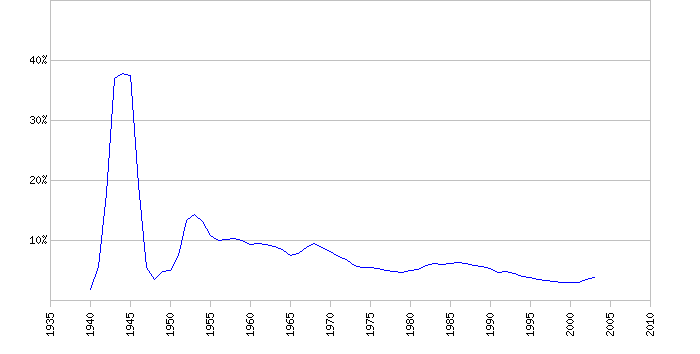
Military spending as % of GDP since 1940
By CosmicConservativeSince Rick posted below about how we are being bankrupted by the Iraq war, I thought I'd just throw out a fact or two, which should always help a debate.
Here's a graph of military spending by the U.S. as a percentage of Gross Domestic Product, the measure that is most commonly used to track military spending and other government spending.
As you can see, military spending has been in a steady decline since its incredible peak during World War II. It is currently about half what it was under Jimmy Carter. Even during Reagan's Presidency military spending declined. Clinton took a huge bite out of it with the ending of the cold war. Bush is pushing military spending into the 4 - 5% range, the highest its been in about a decade, but still less than half of what it was in the 1970s.
So consider that as you read his post about us "bankrupting" our kids.
Well, the graph scaled so it's hard to read, but basically we are at close to the lowest level of military spending in US history, but apparently ANY military spending is too much for some people. The left axis of the graph is 1935 and each increment to the right is five years, going up to 2010. The vertical hashes are 10, 20, 30 and 40%. You can right-click (for PC users) and select "view image" if you want to see it full size.
As you can see, military spending has been in a steady decline since its incredible peak during World War II. It is currently about half what it was under Jimmy Carter. Even during Reagan's Presidency military spending declined. Clinton took a huge bite out of it with the ending of the cold war. Bush is pushing military spending into the 4 - 5% range, the highest its been in about a decade, but still less than half of what it was in the 1970s.
So consider that as you read his post about us "bankrupting" our kids.
Well, the graph scaled so it's hard to read, but basically we are at close to the lowest level of military spending in US history, but apparently ANY military spending is too much for some people. The left axis of the graph is 1935 and each increment to the right is five years, going up to 2010. The vertical hashes are 10, 20, 30 and 40%. You can right-click (for PC users) and select "view image" if you want to see it full size.
Comments (3)